Then
For the prelim task i believed that, and I will openly admit this, that I didnt take it seriously. The effect on the cover was a fluke that came about by playing around with the contrast and saturation of the picture, by happy coincidence it turned out well. There was not a lot of planning or thought behind it and it shows, quite obviously. The lack of taglines and general "thrown together" look makes it seem very unprofessional. Its the same with the contents, the lack of stories and pictures as well as framing show only a basic knowledge of magazines layouts.
Now
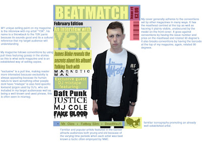
Well, immediately a more in depth knowledge of the layout of magazines is seen from the off. An obvious masthead containing issue number and price can be seen as well as a nicely placed barcode. The pulls and tag-lines are a lot more thought out as well as the layout, more interesting stories pull the readers in and the differing fonts for the bands help maintain the readers attention. The model is very stoic and captivates the reader by creating eye contact.
Although i did not use many new skills on the front cover I like to think that I definitely improved on the skills i already had, for example i'm a lot better at using the lasso tool and feathering the image as well as changing the colours of certain images and texts. Again a massive improvement in the contents page is seen, the photos are now clearly framed and referenced making finding the pages on which they are a lot easier and quicker to find. There are more stories, laid out in much more logical order with varying article types, a few peeves i have are that the contents masthead has a black bar that goes over the rest making it look untidy, and under the artist "Tibbz" there is a white space where i forgot to clone tool his body so there was no white space underneath. The framing of the text "features" and "every month" and the articles in that part mean that the text is nicely broken up and so it means the reader won't get bored to quickly and lose interest.
The double page spread is where i think i let myself down. The layout is probably the most annoying part about it, all the text on one side and the image on the other, this goes against all the conventions of all the magazines i looked at, it makes it a tedious task to read and people will more than likely lose interest a halfway through. Another thing is that i forgot to change the colour of the logo on his shirt to match the front cover so it changes which could be a bit confusing, although saying that i do like the desaturation of the image and the slight colour tinge of blue, it makes the image more "moody" which is a typical thing conveyed by most house artists.
If i was gonna do this whole thing over, i'd probably distribute my time a lot more equally. I spent long on the cover and by the time i came to edit the contents and DPS i had barely any time left. I'd put more pictures on the contents and have more stories because at the moment it lacks enough to make it seem like a "real" magazine. As for the DPS, id change most of it. another one or two pictures, spread the text out more, lose the introducing and shift the picture. Another thing would be to get the full Hi-res versions of the photos because to me they seem a bit blurry.
Thursday, 24 March 2011
evaluation activity 6 (part 4)
Services used (online)
I used flickr to host my photos to put on my blog to make it easier to see for the examiner and so it also was easiest to embed in my blog. Only problem i had with it was the slow upload speeds.
To record my progress throughout the course i used blogger to make a blog. I found it was easy enough to use, having had brief experience with it before, saying that id have rather used something like tumblr as its an easier and less rigid platform to use.
To share the photos i used in my magazine we used facebook, this was both a blessing and a curse. Having the photo's online was good because they were easily accessible from pretty much anywhere (except school ironically) and even gave the option to download hi res versions of them, although it only extended to the photos i used in my draft and not my final piece.
To host my word documents i used Scribd which was easy to use and thats about that, it was useful but nothing more thatn that canr eally be said.

To make my 35 word pitch to the class i used animoto which once we got round the 30 second limit was very cool. Easy to use nice too look at, created a really nice little video without too much effort on my part. And the way it matched the pace to the music was especially cool!
To host my analysis' of covers and such i used slideshare and it was good, same deal as scribd really, did its job and not much else to say about it really.
I used flickr to host my photos to put on my blog to make it easier to see for the examiner and so it also was easiest to embed in my blog. Only problem i had with it was the slow upload speeds.
To record my progress throughout the course i used blogger to make a blog. I found it was easy enough to use, having had brief experience with it before, saying that id have rather used something like tumblr as its an easier and less rigid platform to use.
To share the photos i used in my magazine we used facebook, this was both a blessing and a curse. Having the photo's online was good because they were easily accessible from pretty much anywhere (except school ironically) and even gave the option to download hi res versions of them, although it only extended to the photos i used in my draft and not my final piece.
To host my word documents i used Scribd which was easy to use and thats about that, it was useful but nothing more thatn that canr eally be said.

To make my 35 word pitch to the class i used animoto which once we got round the 30 second limit was very cool. Easy to use nice too look at, created a really nice little video without too much effort on my part. And the way it matched the pace to the music was especially cool!
To host my analysis' of covers and such i used slideshare and it was good, same deal as scribd really, did its job and not much else to say about it really.
Evaluation activity 6 (part 3)
Programs used.
photoshop elements 5.0
At the beginning of the project i was using PS elements 5.0 on the school Pcs and found it hard to adjust to as on my old p.c. i had been using a cs2 which was a newer, more advanced version. I found it difficult to locate certain tools and some didn't exist altogether which disadvantaged me at certain points.
Photoshop CS5
When i got the Imac previously mention and got hold of a copy of CS5 i began to use it anf found it a lot easier that PS elements 5.0 to use because of the developments in it to make the software easier to use as originally it was a very professional software. I also experienced a lot smoother experience as it was less demanding on RAM
Microsoft office 2010
I used office to write up my article quickly so if i made a mistake or needed to change it at a later date it would be easier, it was easy enough to use and it always has been.
evaluation activity 6 (part 2)
Computers used
School PC's
I used for a while at the beginning of the course the computers at school, i encountered many problems during using them for example, a problem that plagued me throughout was a lack of RAM on the machines i was using. I found this happened a lot because of the size of the files in photoshop meant they were draining the RAM like nobodies business.
27" Imac
towards the end of the course i got a iMac at home and installed photoshop on it and found that i ended up doing most of my work on it. This is because i used the latest version of photoshop which meant that there was little back compatibility with school as well as lacking several fonts that i used with my magazine. The RAM problem was gone, the mac was a lot quicker to respond and made making my magazine simple.
Evaluation activity 6 (part 1)
Cameras used.
Canon 1000D
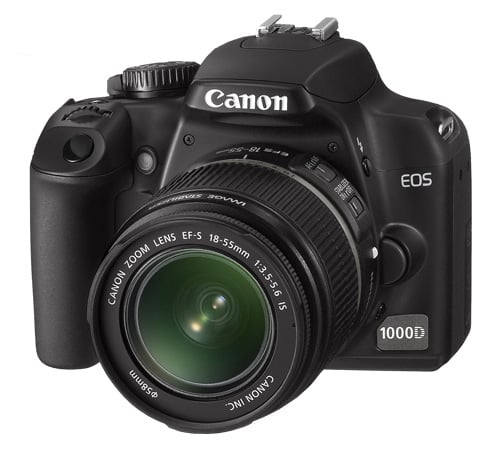
For my final magazine picture I used the Canon 1000D Slr camera. It delievered great quality pictures and was very easy to use, it was also easy to use different modes and its quick shutter meant that i could get several photos in a matter of seconds.
This is the camera I used to take the pictures for my draft version of my magazine. It was a good camera delivering nice quality shots, the flash was nice but too easy to obstruct.
Canon 1000D
For my final magazine picture I used the Canon 1000D Slr camera. It delievered great quality pictures and was very easy to use, it was also easy to use different modes and its quick shutter meant that i could get several photos in a matter of seconds.
Sony NEX5KS Alpha Compact System Camera
This is the camera I used to take the pictures for my draft version of my magazine. It was a good camera delivering nice quality shots, the flash was nice but too easy to obstruct.
Evaluation activity 4
Why would my TA buy my magazine?
My target audience would buy my magazine because of familiar artist names from familiar genres such as "magnetic man" who are a dub step group. Another reason they would is because they would be attracted to the familiar clothing label sported by my model on the front as its an established streetwear brand often found to be worn by my target audience as well as being very in fashion at the moment. It would also appeal to them because the name is known to dj's because its in their lexis.
Wednesday, 23 March 2011
Evaluation activity 1 (part 2)
This is an example of a pre existing music magazine (mixmag) which is similar to the final version of mine.You can find the key generic conventions highlighted in yellow.
Evaluation activity 1 (part 1)
In what ways does your media product use, develop or challenge forms and conventions of real media products? (i.e. of music magazines)
My magazine utilizes a semi standard layout taken by many magazines including ones like Q and NME, this is by having my masthead at the top and having it unobscured by things like pictures and bad color schemes. Ways in which i deviated from the norm in the layout of my magazine would probably be the positing of the barcode, sideways under the masthead, and the positioning of the issue number and price. I say this because its sideways on and actually embedded within the mast head. During my Research and planning i had a look at several magazines already on the market (Cover analysis) and attempted to try and make my magazine adhere to things that i saw that were relatively universal across most genres.
Thursday, 10 March 2011
Friday, 4 March 2011
Thursday, 3 March 2011
Contents page 2
took into account the advice given, added a lot more stories fixed some things and all round gave it another shot, still unfinished as is the cover as im getting the pictures soon.
Monday, 28 February 2011
Front Cover Mark 2
Having got some fairly dodgy feedback regarding my front cover i decide to reamp it taking onboard the advice given, i added more taglines and edited the few things that were missing beforehand. I now have 2 versions, one an original that ive created and one that is based off Q magazine front cover as i thought it was pretty effective. I have yet to get a new model on there but im using Joe Chamberlain who was on Harry tibbles magazine as i think he fits the profile quite well.
 |
| The preferred one, based off Q |
 |
| Original idea by me, slightly different to the preffered. |
Monday, 14 February 2011
Wednesday, 9 February 2011
Dps analysis sam cook
Check out this SlideShare Presentation:
Dps analysis sam cook
View more presentations from meganr93.
Contents analysis sam cook
Check out this SlideShare Presentation:
Contents analysis sam cook
View more presentations from meganr93.
Wednesday, 26 January 2011
Magazine front cover mock ups
For the mock ups i stuck to the colour scheme mostly but when i deemed necessary deviated to gold because i thought itd look better.
Tuesday, 25 January 2011
Well I’ve managed to track down new boy on the block Casionova for an interview with beatmatch, now firstly what do I call you? MR Nova? Cas?
Haha, Harry will do fine, and thanks for having me today
So tell me, Whats your favourite kind of music? I mean, we know you’re a house artist predominantly but have been known to dabble. But what is your favourite genre?
Well, much like my music, I dabble in music. My ipod is literally filled with every kind of music imaginable. ACDC to ZZ Top. I just LOVE music. Which in my field of work is probably for the best!
the question on everyone’s mind is, First album, debut onto a relatively popular scene right now, what sets you apart from every other guy with a laptop and tracktor?
Well, haha, anyone with a decent laptop can download a program and become a “artist” nowadays. It’s more so the skill behind the laptop, the pen is mightier than the sword but the writer is more powerful than both. That and I suppose the connections that I have within the music world. I have a lot of people collaborating on my debut album, the likes of crookers and daft punk have helped out, and they’ve been great!
So some pretty big hitters in varying sub genres then! Now you’ve got somewhat of a rep around as a, well, lets say unconventional artist. A lady gaga on the dj spectrum, how did that come about?
Well, Lady gaga sets out to cause controversy, she aims to be weird and “unique” whereas I guess with me its just sort of natural, I’ve never liked to stick to the norms other people have said, they make me uncomfortable. I’ve been known to hop out of bed, turn my swag on, look in the mirror and say “that’ll do” and leave the house. I don’t put on a slew of dead kermits to be odd I just am!
Haha, without a doubt you’re a bit eccentric, whats the weirdest story you have from when you were touring?
Well, unfortunately I have a few. The strangest story ive got is pieced together from other peoples recollections, photos and what small amounts I remember from my liquor induced madness. I’d just finished my 100th set and at this point id consumed a bottle of hennesey I had been bought as a present. Now at this point I had the ephemeral haze of, “ok, its your liver, stop now please” but like any self respecting imbecile I ignored it and carried on drinking. And that’s where it all goes blank. The photos show many things, most unsavoury, one of the few I could tell you about is me drink jager out of a shoe. No idea why but what I do know is that I'm banned from playing and going to 6 venues in Newcastle and apparently one in Crete.
Crete?! As in Greece Crete?
Yeah, the owner of one of the bars had another venue there which im banned from, odd really…
Certainly sounds like one hell of a wild night! So have you got anything on the cards for the upcoming month or years?
Well, as a bonus, ive decided to release the unheard songs off the album as a free mixtape, I decided that having made them someone ought to hear them, be a bit of a waste otherwise haha. I’ve also just finished arranging a world tour with numerous other DJ’s and artists, the dates and venues are being announced soon but I can confirm that there’s going to be 7 UK dates with the likes of magnetic man, doctor p and some other special guests.
Sounding like its going to be a busy year for you then, How are you finding the rocket to fame, going from unknown underground DJ to superstardom, I mean, they’re pretty much polar opposites!
Yeah, this is what it must’ve been like for SuBo haha. Nahh, yeah, its interesting to say the least. When I used to go into the supermarket after days of being locked away in a room creating and tweaking tunes I got looks of “who’s this guy? Why does he smell so bad”. Now I’m going in, still looking weird, still smelling like feet and yet people run up to me, start shaking my hand, hugging me, asking for photos. It’s a change: I think I like it.
Well, now, another question that’s on everyone lips. Its been rumoured that you’ve been roped in by another well known artist whose name we aren’t allowed to disclose, starting with K and ending in West to produce his next album? Can you expand on these?
Well, Mr. W has indeed approached me. We were at a red carpet event and he strolled up to me all confident and said quite calmly “we need to talk business”. So we did. And im going to have to say apart from that, there’s little else I can say about that unfortunately, but there are cards on the table.
Now that Is interesting! Now speaking of collaborators did you enjoy working with the other artists on your album?
Well, I put some trousers on to meet them. And in the year of making the album I had only put on trousers 6 times (not counting visits to the shops) to leave the house. I had an amazing time swapping stories and they imparted so much wisdom from their time in the game! I have to say out of all of them Daft Punk may have been the most fun to hang out with! They’ve even made me consider purchasing some new add-ons to my set as I had so much fun mucking around with theirs! I mean ableton is simply a blast!
Well thanks for taking the time to talk to us about you and we hope that the tour goes well, as well as maybe or maybe not a collab with Mr West!
Its been great chatting! Thanks for getting me out of the house haha!
Golden Spiral
"The golden spiral means that there should be something, leading the eye to the center of the composition. It could be a line or several subjects. This "something" could just be there without leading the eyes, but it will fulfill its purpose anyway."
I dont think my test shots adhere to the golden spiral rule as they are front on, and have nothing to lead he eye to the centre of the photo, there's not really a focal point on the pictures.
I dont think my test shots adhere to the golden spiral rule as they are front on, and have nothing to lead he eye to the centre of the photo, there's not really a focal point on the pictures.
Publisher
I chose EMAP to be the publishers of my magazines because they are a successful media empire not only having things going in the magazine sector but most others as well. A big factor as to why I chose them is because they also publish mixmga and I believe that I could piggy bacjk off the fame and respect of mixmag and introduce a magazine which caters to other types of music (dubstep, House, ect) Meaning that it will be seen as equal to mixmag making more people want to purchase it.
Artist profile
My artist is called Y3k and is a laptop artist who has ventured into many genres of music but stays mainly in the house style reigon of music. He is well know for having a scruffy style of “find clothes, put them on and leave” persona with little forethought to how to constrain to norms for certain aspects of his life. He has just released his first album “NSFW (never safe for work)” and has the likes of crookers and daft punk being a driving force behind this first venture into the mainstream music business.
He was picked after having his mixtapes and demos heard by the heads of certain un named music companies and when approached agreed to make an album only if he could have certain artists help produce his tracks. He is unconventional and an “odd ball” because of his habits of turning up late to live sets and then leaving before his time is up.
The photoshoot will take place in the media studio and im using a white backdrop because having looked at other photoshoots featuring similar artsists and there is a pattern of crisp white backdrops and minimalistic feel to it. I will have him wearing a blue obey tshirt to match the colour scheme of the magazine and will feature some of the things ive mentioned earlier in the blog.
Test shots/ evaluation.
These are a few of my test shots that i took with a canon 1000d. I used this camera because I am going to use the same one for my actual coursework. I tried to keep a plain background in these test shots because i am using a white background because its a theme within most article featuring a DJ to have clean lines. I used a mid shot and close up as these are going to be the shots i use for my article. I also used a different model (may not be the person I use in my coursework) to pose for some contents page shots. I am glad i took some mid shots because theyre quite integral for my magazine but i forgot to have a sample of someone shouting which i was going to use for my front cover.


Tuesday, 18 January 2011
Pitch evaluation
I believe my pitch went quite well, i put in a fair amount of time into the animoto and think that had I gone with a power point or generic moodboard it wouldve been a bit bland, animoto really gave it a kick. From the questions posed to me by the group I decided to do a artsit as i was toying between artist or group but the questions really helped me narrow it down. Another thing posed was that my genre isnt particularly wide and that it doesnt get much coverage with exception to like 2 other magazines, like mixmag, and that my audience needed to be more precise as my Animoto seemed to hint that the magazine was for more live DJ's who remix on the spot than laptop musicians.
Wednesday, 12 January 2011
Thursday, 6 January 2011
Wednesday, 5 January 2011
Tuesday, 4 January 2011
Monday, 3 January 2011
Subscribe to:
Comments (Atom)


