Then
For the prelim task i believed that, and I will openly admit this, that I didnt take it seriously. The effect on the cover was a fluke that came about by playing around with the contrast and saturation of the picture, by happy coincidence it turned out well. There was not a lot of planning or thought behind it and it shows, quite obviously. The lack of taglines and general "thrown together" look makes it seem very unprofessional. Its the same with the contents, the lack of stories and pictures as well as framing show only a basic knowledge of magazines layouts.
Now
Well, immediately a more in depth knowledge of the layout of magazines is seen from the off. An obvious masthead containing issue number and price can be seen as well as a nicely placed barcode. The pulls and tag-lines are a lot more thought out as well as the layout, more interesting stories pull the readers in and the differing fonts for the bands help maintain the readers attention. The model is very stoic and captivates the reader by creating eye contact.
Although i did not use many new skills on the front cover I like to think that I definitely improved on the skills i already had, for example i'm a lot better at using the lasso tool and feathering the image as well as changing the colours of certain images and texts. Again a massive improvement in the contents page is seen, the photos are now clearly framed and referenced making finding the pages on which they are a lot easier and quicker to find. There are more stories, laid out in much more logical order with varying article types, a few peeves i have are that the contents masthead has a black bar that goes over the rest making it look untidy, and under the artist "Tibbz" there is a white space where i forgot to clone tool his body so there was no white space underneath. The framing of the text "features" and "every month" and the articles in that part mean that the text is nicely broken up and so it means the reader won't get bored to quickly and lose interest.
The double page spread is where i think i let myself down. The layout is probably the most annoying part about it, all the text on one side and the image on the other, this goes against all the conventions of all the magazines i looked at, it makes it a tedious task to read and people will more than likely lose interest a halfway through. Another thing is that i forgot to change the colour of the logo on his shirt to match the front cover so it changes which could be a bit confusing, although saying that i do like the desaturation of the image and the slight colour tinge of blue, it makes the image more "moody" which is a typical thing conveyed by most house artists.
If i was gonna do this whole thing over, i'd probably distribute my time a lot more equally. I spent long on the cover and by the time i came to edit the contents and DPS i had barely any time left. I'd put more pictures on the contents and have more stories because at the moment it lacks enough to make it seem like a "real" magazine. As for the DPS, id change most of it. another one or two pictures, spread the text out more, lose the introducing and shift the picture. Another thing would be to get the full Hi-res versions of the photos because to me they seem a bit blurry.
Services used (online)
I used flickr to host my photos to put on my blog to make it easier to see for the examiner and so it also was easiest to embed in my blog. Only problem i had with it was the slow upload speeds.
To record my progress throughout the course i used blogger to make a blog. I found it was easy enough to use, having had brief experience with it before, saying that id have rather used something like tumblr as its an easier and less rigid platform to use.
To share the photos i used in my magazine we used facebook, this was both a blessing and a curse. Having the photo's online was good because they were easily accessible from pretty much anywhere (except school ironically) and even gave the option to download hi res versions of them, although it only extended to the photos i used in my draft and not my final piece.
To host my word documents i used Scribd which was easy to use and thats about that, it was useful but nothing more thatn that canr eally be said.
 To make my 35 word pitch to the class i used animoto which once we got round the 30 second limit was very cool. Easy to use nice too look at, created a really nice little video without too much effort on my part. And the way it matched the pace to the music was especially cool!
To host my analysis' of covers and such i used slideshare and it was good, same deal as scribd really, did its job and not much else to say about it really.
Programs used.
photoshop elements 5.0
At the beginning of the project i was using PS elements 5.0 on the school Pcs and found it hard to adjust to as on my old p.c. i had been using a cs2 which was a newer, more advanced version. I found it difficult to locate certain tools and some didn't exist altogether which disadvantaged me at certain points.
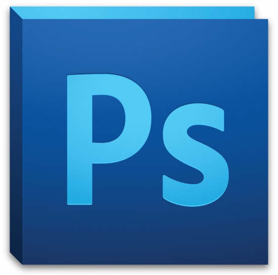
Photoshop CS5
When i got the Imac previously mention and got hold of a copy of CS5 i began to use it anf found it a lot easier that PS elements 5.0 to use because of the developments in it to make the software easier to use as originally it was a very professional software. I also experienced a lot smoother experience as it was less demanding on RAM
Microsoft office 2010
I used office to write up my article quickly so if i made a mistake or needed to change it at a later date it would be easier, it was easy enough to use and it always has been.
Computers used
School PC's
I used for a while at the beginning of the course the computers at school, i encountered many problems during using them for example, a problem that plagued me throughout was a lack of RAM on the machines i was using. I found this happened a lot because of the size of the files in photoshop meant they were draining the RAM like nobodies business.
27" Imac
towards the end of the course i got a iMac at home and installed photoshop on it and found that i ended up doing most of my work on it. This is because i used the latest version of photoshop which meant that there was little back compatibility with school as well as lacking several fonts that i used with my magazine. The RAM problem was gone, the mac was a lot quicker to respond and made making my magazine simple.
Cameras used.
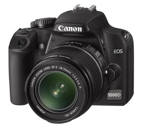
Canon 1000D
For my final magazine picture I used the Canon 1000D Slr camera. It delievered great quality pictures and was very easy to use, it was also easy to use different modes and its quick shutter meant that i could get several photos in a matter of seconds.
Sony NEX5KS Alpha Compact System Camera
This is the camera I used to take the pictures for my draft version of my magazine. It was a good camera delivering nice quality shots, the flash was nice but too easy to obstruct.